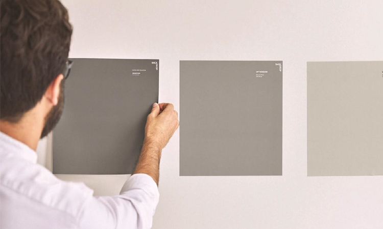
PANTONE DIRECTION
TEMPERED TASTES
neutral color palette
潘通方向
温和的品味
中性调色板
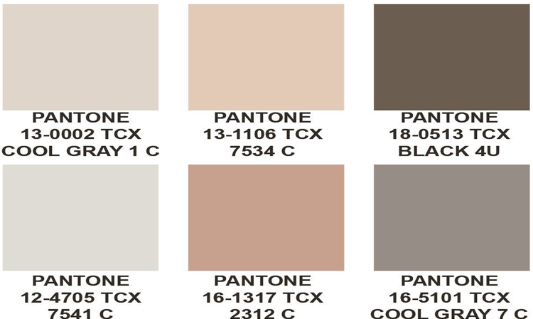
NEUTRAL COLOR PALETTE
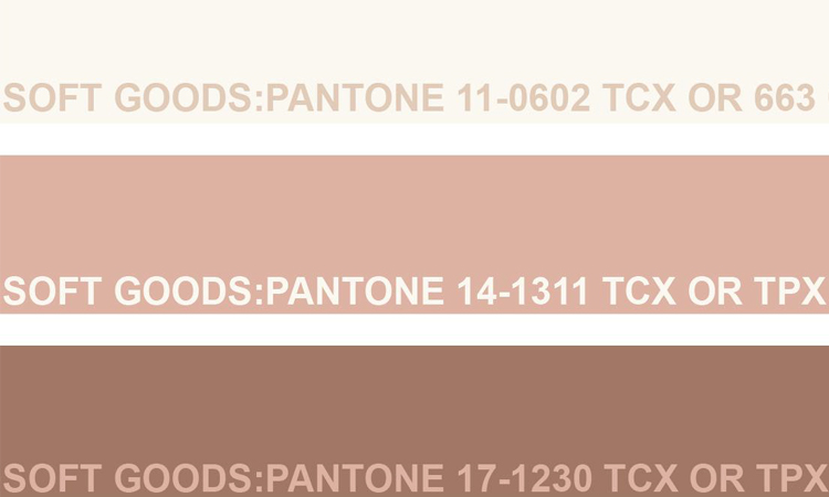
As seen in the product
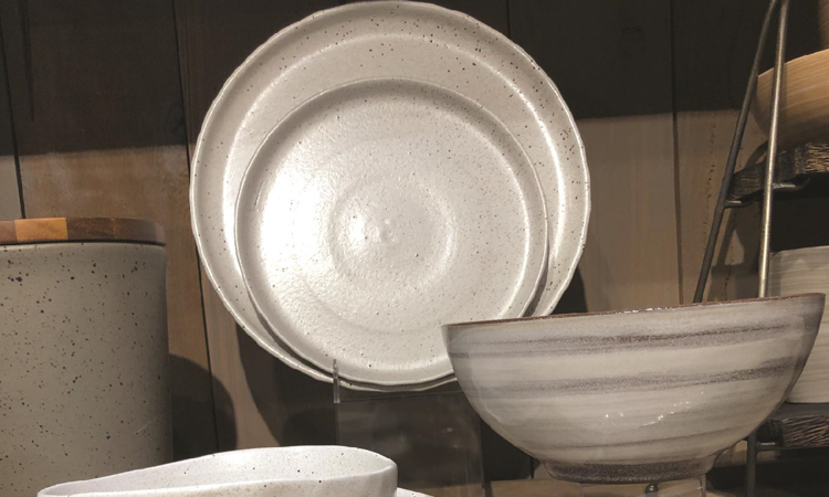
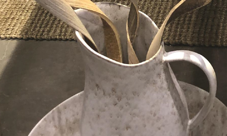
This is a great representation on how you should use nuetrals. It does not mean that doing a solid product in a nautral color is enough to make it interesting. Add texture and technique to enhance it.
中性调色板
如产品所示
这是如何使用中性色的一个极佳的代表。这并不是说,在固态产品上使用自然色调就足够有趣了。增加纹理和技术来加强它。
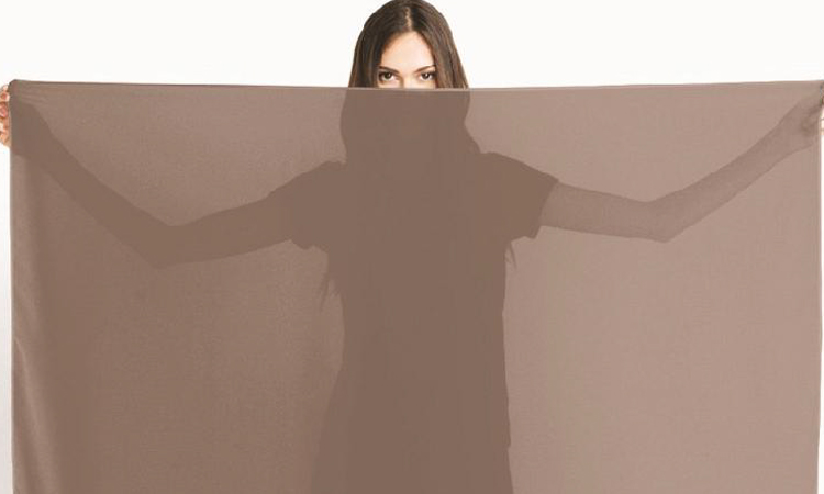
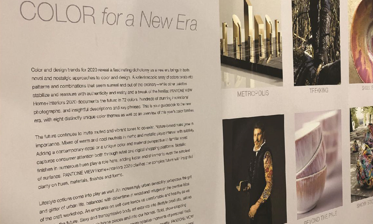
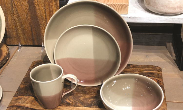
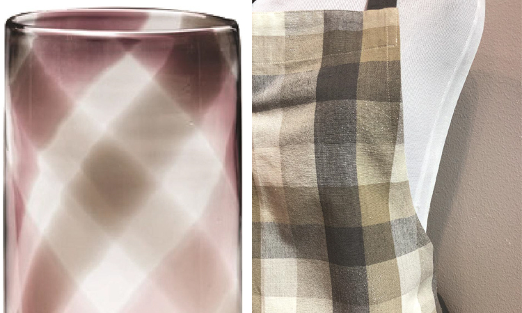
NEUTRAL COLOR PALETTES
used as patterns on products
This is a great way to make a neutral pattern exciting and yet saleable to the US & Euro markets. The photo on the bottom shows a larger scale plaid on dinnerware using a watery glaze. The item on the right is a plaid apron and it is hard to see but it has a lurex / shine to it which was beautiful and unexpected.
中性调色板
用作产品上的图案
这是让中性图案变得令人兴奋,同时也畅销欧美市场的方式之一。底部的照片展示了餐具上,以水釉的方式呈现的,较大尺寸的格子图案。右边的产品则是格子围裙,这是很难见到的,但是产品上确实有美丽且出人意料光泽/闪光。
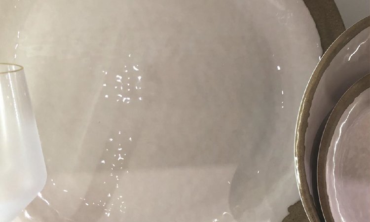
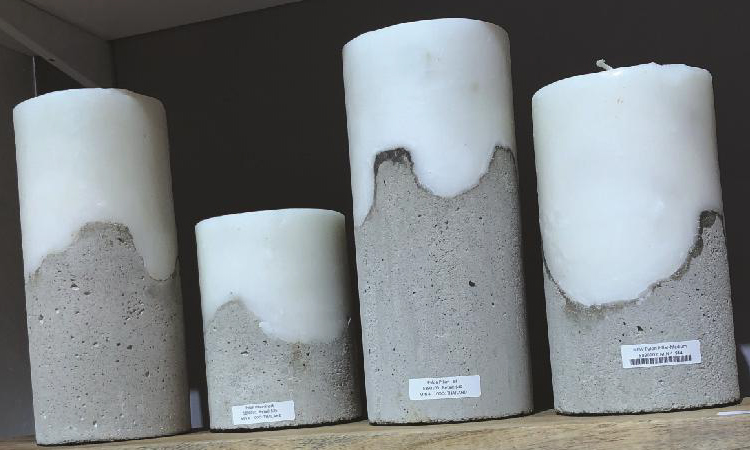
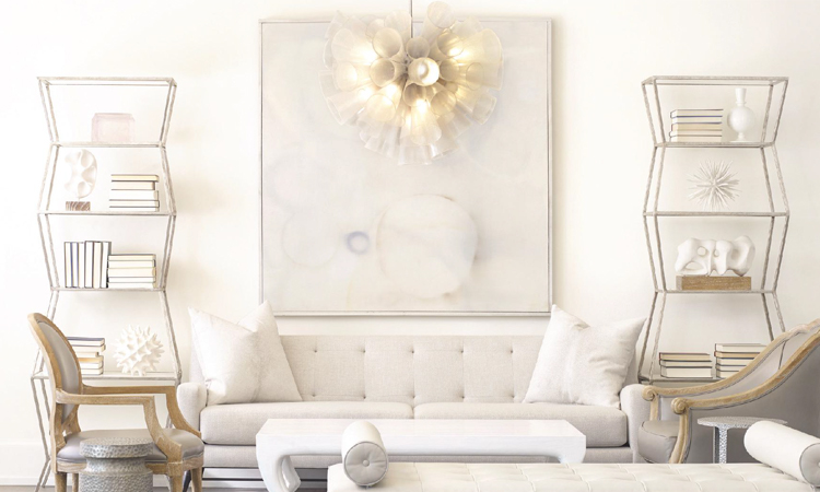
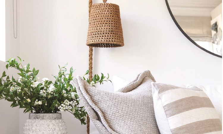
NEUTRAL COLOR PALETTES
As seen as interior trends
中性调色板
如图作为室内趋势
★文章来自《2019芝加哥春季国际家居及家庭用品展会分析报告》。
★点击此处,查看更多报告详情:http://www.chdesign.cn/report/31.html
与设计师合作
更多该设计师作品详情,
(转载请注明出自爱原物,盗版必究)
 爱原物APP


 诚实守信
诚实守信 尊重版权
尊重版权 扎实服务
扎实服务 共同分享
共同分享

 微信公众号
微信公众号
 新浪微博
新浪微博