ORANGE
COLOURS
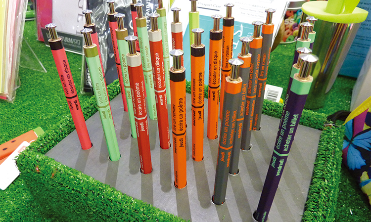
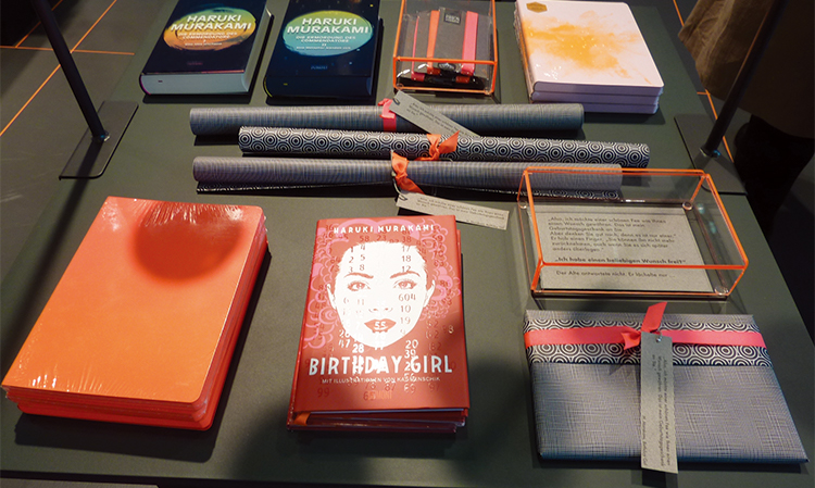
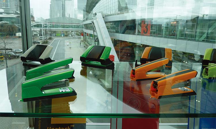
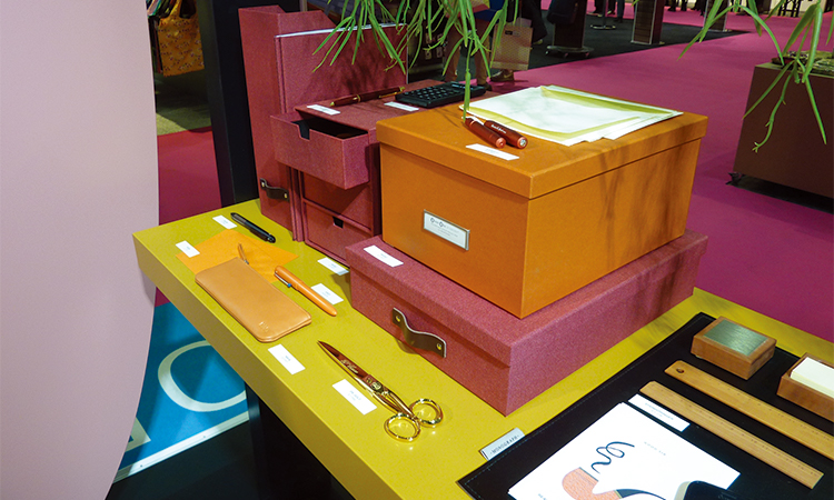
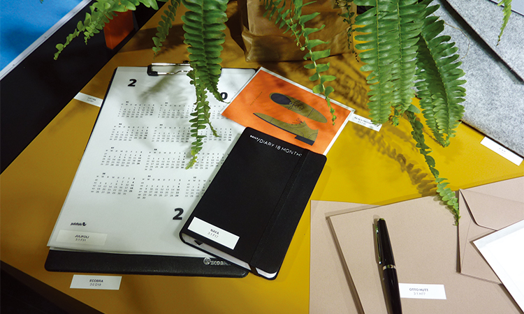
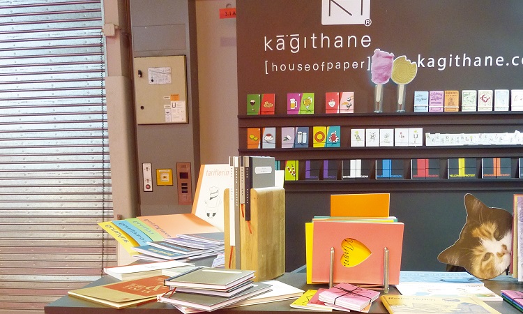
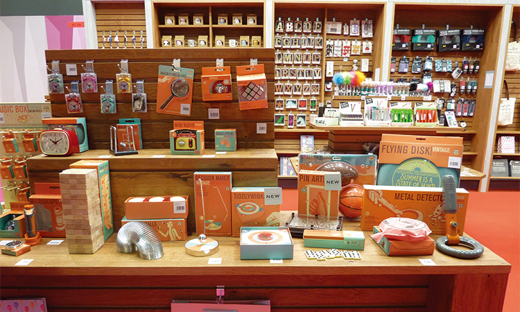
The colour orange appeared everywhere at Paperworld.
The colour was so strong and striking and stood out in any display.
The colour has been used on many different products and substrates.
The colour is bright but on the earth side rather than neon.
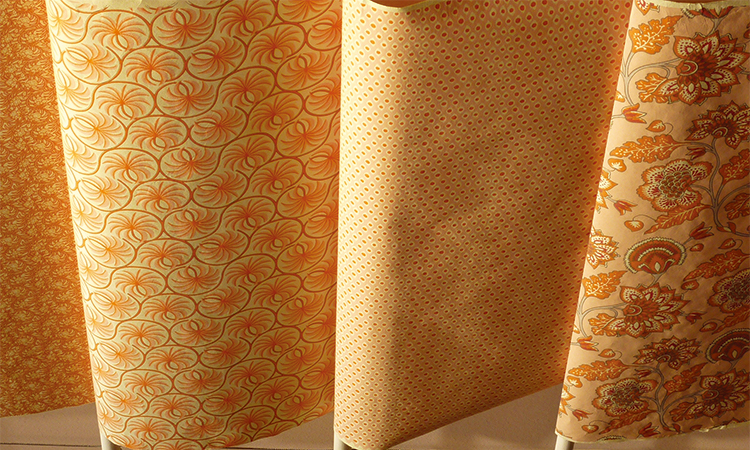
Orange has been used in many different design applications as well. It has been used on traditional patterns and acrylic edges.
Orange is also very popular on stationery accessories.
Orange has been mixed with reds and greys but on the majority it stands alone.
橙色调
法兰克福国际文具展上到处都是橙色。
这一颜色是如此的强势醒目,在任一展厅上都很突出。
被用在许多不同的产品和基底上。
这一颜色明亮鲜艳,但是比霓虹色更加朴素。
橙色也应用在不同的设计方式上。可用在传统的图案和亚力克边缘上。
橙色在文具配件上也很受欢迎。
可以混合红色和灰色,但是大多数情况下,单独使用橙色。

ORANGE
COLOURS
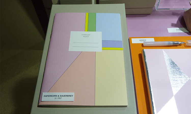
There was so much orange at Paperworld! that it was also used in displays and packaging as illustrated opposite.
Large areas of orange has been used in the design of packaging and display units.
Orange is the main colour within these designs teamed only with limited amounts of other colours.
橙色调
法兰克福国际文具展上有如此多的橙色!也作为插画的对比,用于陈列和包装。
大面积的橙色被用于包装和陈列品设计。
橙色是这些设计的主色调,搭配有限的其他颜色。


★文章来自《2019德国法兰克福国际文具展分析报告》。
★点击此处,查看更多报告详情:http://www.chdesign.cn/report/22.html
与设计师合作
更多该设计师作品详情,
(转载请注明出自爱原物,盗版必究)
 爱原物APP




 诚实守信
诚实守信 尊重版权
尊重版权 扎实服务
扎实服务 共同分享
共同分享


 微信公众号
微信公众号
 新浪微博
新浪微博