GREEN
COLOURS
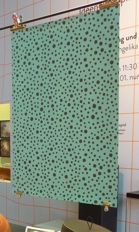
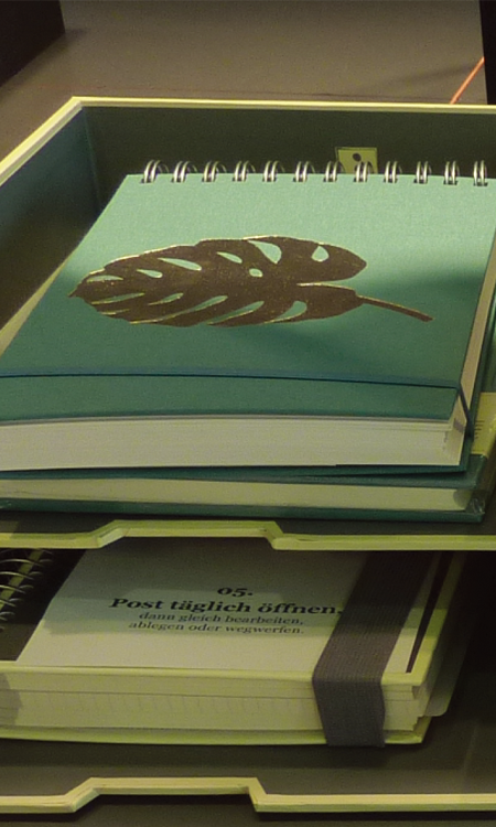
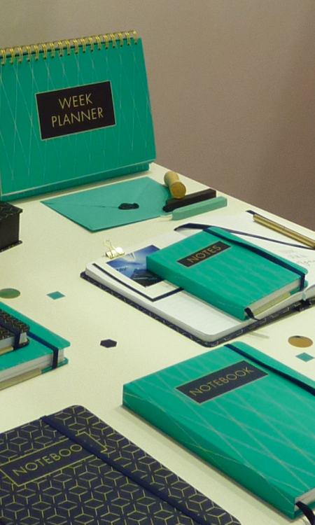
The popularity of green colours at Paperworld really stood out. This is probably enhanced by the popularity of plant icons. Lots of different shades are presented within exhibitions at Paperworld but this green especially looks really strong. This green has been developed on more graphic styled products leaving the yellow/green to more naturally illustrated styled products.
Green is less popular in the UK because it is considered bad luck. This green though is on the blue side giving it a brighter feel.
绿色调
法兰克福国际文具展上,大量流行的绿色调十分突出。可能是植物图案的流行所推动的。法兰克福国际文具展上,展品中呈现了大量不同绿色调,但是,这种绿色看起来尤为强势。这一绿色调被用在更加抽象的、风格化的产品上,相对的,黄色/绿色被用在更加自然的、插画风格的产品上。
在英国,因为象征着坏运气,绿色不那么流行。偏向蓝色的绿色带来更加明亮的感觉。
★文章来自《2019德国法兰克福国际文具展分析报告》。
★点击此处,查看更多报告详情:http://www.chdesign.cn/report/22.html
与设计师合作
更多该设计师作品详情,
(转载请注明出自爱原物,盗版必究)
 爱原物APP


 诚实守信
诚实守信 尊重版权
尊重版权 扎实服务
扎实服务 共同分享
共同分享

 微信公众号
微信公众号
 新浪微博
新浪微博